Increasing Expense Settlement Success Rate on Splitwise through
Multi-Currency Support, Digital Wallet, and Admin Features.
UX/UI Case study
2025
The Core Challenge
Have you ever gone on a group trip, and after ten days of fun, it’s time to figure out who paid for what, and who still owes whom? That moment when you’re scrolling through receipts or reminding a friend they owe you money never feels great, right?
A product design case study to uncover why group settlements often failed due to manual tracking, lack of payment transparency, multi-currency confusion, and social friction over fairness.
Product
Splitwise is a utility tool that acts as a digital ledger for shared group expenses. Its primary function is to accurately track and facilitate the division of costs among friends, roommates, or travel companions. Users can log expenses, specify who paid and who owes, and the app automatically calculates balances. It then uses a debt simplification algorithm to minimize the total number of necessary transactions for the final settlement.
The ultimate goal isn't just the accurate division of money, but the preservation of the friendship itself.
Splitting expenses with friends, whether on trips or as roommates, is common. However, beneath these calculations lies a complex world of emotions. Money can create stress, feelings of unfairness, and tension. Bill-splitting tools aim to ease this burden and maintain friendships. Yet, if the process becomes complicated, especially in large groups, it can harm relationships instead of helping.
What We Uncovered
The real issue goes beyond splitting money, it’s about preserving relationships and building trust, which matter far more than the math itself.
Our desk research revealed a clear pattern in user feedback: the main frustration isn’t wrong math, but the anxiety these apps create. Users want simplicity and fairness, yet poor transparency often leads to the mistrust they hoped to avoid.
Where the Design Stumbled
Heuristic Evaluation revealed major usability gaps in efficiency and error prevention.
The evaluation revealed that the most significant usability challenges lie in Efficiency of use and Error Prevention, where users are most at risk of making mistakes or facing unnecessary friction. In contrast, Visibility of system status and Recognition rather than recall appeared as stronger areas with fewer critical issues.
When We Listened Closely
Users weren’t asking for smarter math, they were asking for clearer roles, simpler tools, and fewer headaches.
We conducted five in-depth interviews with active Splitwise users to understand their workflows, frustrations, and expectations. These conversations helped us uncover the social and emotional patterns behind expense sharing.
When Personas Came Into Focus
Some wanted to manage every detail. Others just wanted to trust and pay. But both struggled to make Splitwise work for them.
Two different stories kept coming up. Some users step in as organizers, carefully managing every number to keep things accurate. Others just want a quick, trustworthy way to pay their share. Despite their different approaches, both groups face unnecessary friction in Splitwise.
How the experience unfolds
Both personas begin their journey with excitement, but end up frustrated.
Both personas start their journey feeling positive about using Splitwise , it promises simplicity and relief in managing shared costs. However, as their needs grow more complex, frustrations set in: one struggles with the lack of clarity and trust in multi-currency expenses, while the other feels overwhelmed by the difficulty of managing large groups. This emotional shift highlights the product’s gap between initial appeal and
long term usability.
How others solve it
Splitwise’s strength lies in Simplicity but it's manual tracking model makes it more traditional compared to other products
Competitors simplify complex group expenses with automation and smart defaults.
Other apps integrate payments and multi-currency support directly, while Splitwise forces more manual effort.
Leading competitors focus on clarity and summaries, turning long lists into easy-to-digest overviews.
Splitwise’s strength lies in simplicity and user trust, but it lags behind in efficiency and advanced features.
Where possibilities emerge
We shaped six focused opportunity areas to guide the redesign.
We synthesized ideas into six clear clusters: Control & Management, Transparency & Trust, Social & Communication, Strategic/Transformational, and Experience Enhancers. Each concept was scored by impact and effort to surface quick wins and validate larger bets. The result is a prioritized roadmap that reduces calculation anxiety, improves coordination, and sets a path for future innovation.
How we Brought the Solution to Life
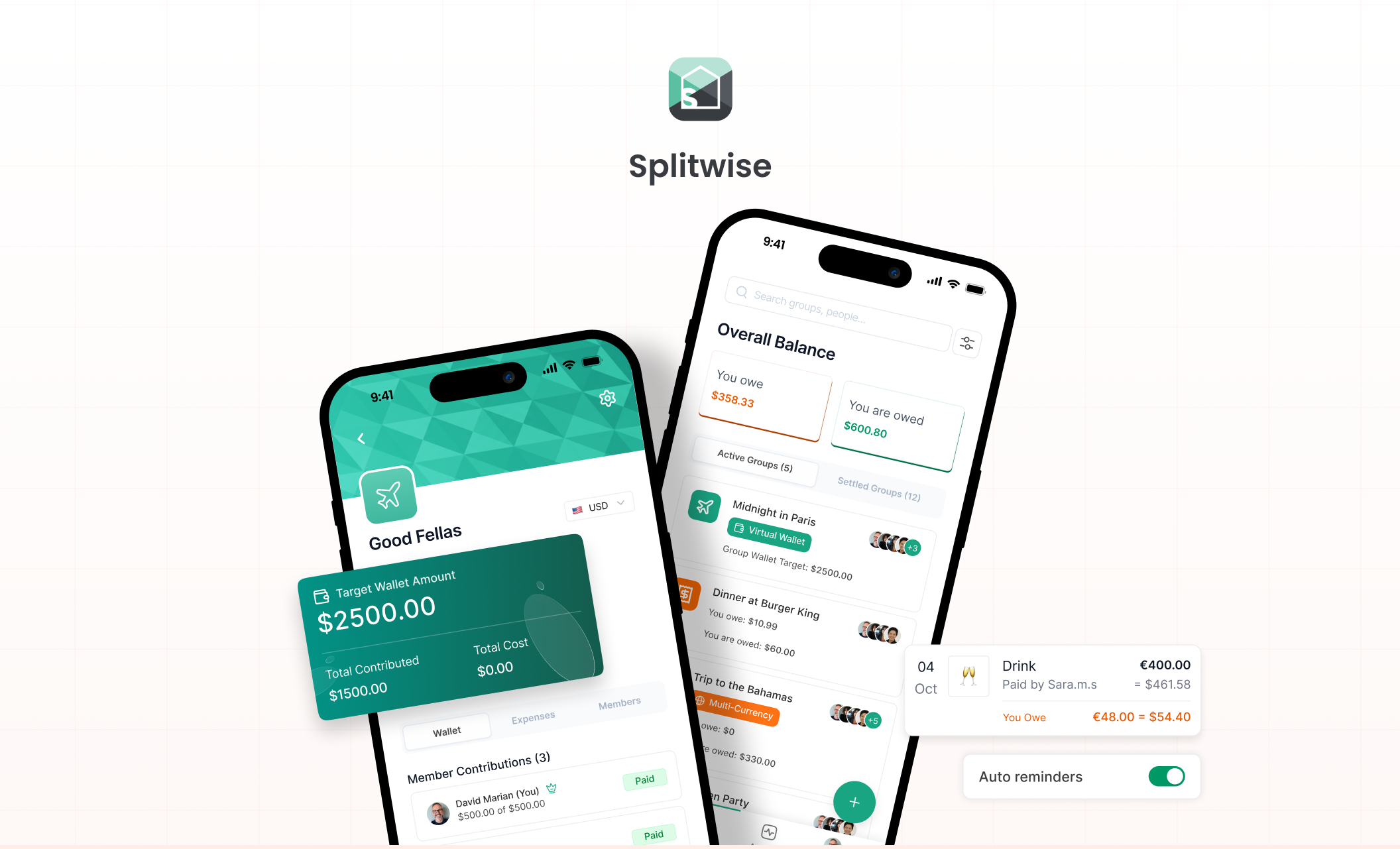
We designed four focused improvements to make shared expenses clearer, simpler, and more reliable.
Each solution focused on reducing confusion and building user trust.
Growth & Learning
I realized finance isn’t just about numbers , it’s about people.
What I learned from this project is how deeply financial matters affect human relationships. During the desk research, I was initially shocked to discover statistics about the friendships and connections lost over money issues. This realization shifted my perspective: finance isn't just about inputting numbers; it's about trust, communication, and emotional management.
This project fundamentally changed my approach to designing for high stakes situations. I realized that even small misunderstandings around money can create distance between people, demanding absolute clarity. This work reinforced the value of empathy and patience in the design process. It taught me to design features proactively not just to resolve technical complexity, but to directly restore user confidence and minimize the need for awkward, real world confrontation.